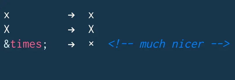
use × HTML entity for close buttons rather than the letter X for a perfectly angled ×
I posted this simple tip to twitter and it was instantly popular with developers from all around the world. It's a small improvement that makes a big visual difference in your applications.
https://twitter.com/wesbos/status/499245255703949312
Since a tweet is only 140 characters, I thought I would expand on best practices a little bit in a post.
Using UTF-8
A few mentioned that you can just go ahead and use the unicode × instead of the HTML entity ×. As long as your document is setup for UTF-8, go ahead. I personally rather use the HTML entity × because I can remember and type that, whereas × needs to be copy and pasted from a blog post like this.
Accessibility
If a visually impaired user uses a screenreader like JAWS to access your website, this will read multiplication to them. So, it is very important that you use proper aria attributes. Something like this will work great:
<a href="#" aria-label="Close Account Info Modal Box">×</a>
or better yet:
<button aria-label="Close Account Info Modal Box">×</button>
Other Appropriate Characters
A few more mentioned that it would be better to use ❌ and ❎ as they are real × characters rather than just the multiplication sign. While these are great, they are 1) Not supported on many systems. I'm on osx 10.9.4 and Chrome Canary and they are just boxes. ❌ ❎ 2) twitter and the iPhone swap them out with goofy looking emojis.
So unfortunately, not a good solution just yet.
https://twitter.com/SelenIT2/status/499321739411996672
Find an issue with this post? Think you could clarify, update or add something?
All my posts are available to edit on Github. Any fix, little or small, is appreciated!

 This shit is the best
I carry a knife and it always frays my jeans on the pocket. I cover it with a nylon patch and it lasts forever.
I also repaired a down coat and nylon hammock with it. Amazing stuff
  here is the new CSS Border shape API
this is going to unlock so many sick new designs